
So this is for those of you who use email as part of your marketing.
From MarketingProfs.com this week:
It's the Same, but Different
 |
Dooley cites research by Hyunjin Song and Norbert Schwarz, who asked two groups to estimate the amount of time required for identical exercise regimens.
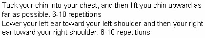
The first group read instructions in Arial—a simple, streamlined font:
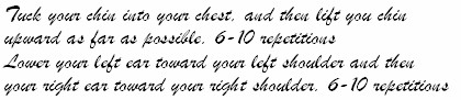
For the second group, Song and Schwarz used the much-fussier Brush font:
"The results were astounding," notes Dooley. "[T]he subjects who read the same instructions in the hard to read font estimated that the regimen would take nearly twice as long, 15.1 minutes vs. 8.2 minutes."
The Po!nt: When you're asking customers to do you a favor, increase participation levels by using a simple font that reduces their perceived time commitment.
Source: Neuromarketing. Click here for the full post.
Sphere: Related Content


No comments:
Post a Comment