
When you have a successful brand, is it wise to Re-Brand it? Take a look:
Dollar Brand
![]()
Dollar General has 8,400 retail stores, $10.5 billion in annual sales and everyday low prices on everyday products. Its new identity has been designed by Interbrand Design Forum, who share with us the positioning and rationale they worked with.
Brand positioning:
We provide top brands and quality alternatives to her at the lowest prices so she can provide her family with all the essentials and treats they’ll love. We understand she wants a great quality of life, but has to manage it on a modest budget. We operate the same way, with clean, no frills stores that provide ease, convenience, and friendly service to her. Helping her save time, save money, everyday.
The identity design rationale from Interbrand:
Our identity is our signature icon. As our brand ambassador, it proudly celebrates our heritage of delivering value with the “stretched dollar” shape of the carrier and the straight-forward typography of our wordmark. Our identity is friendly, bold, simple, and energetic. Our core brand colors, yellow and black are our most sacred brand equities and have been carefully balanced to maximize the impact of our identity.
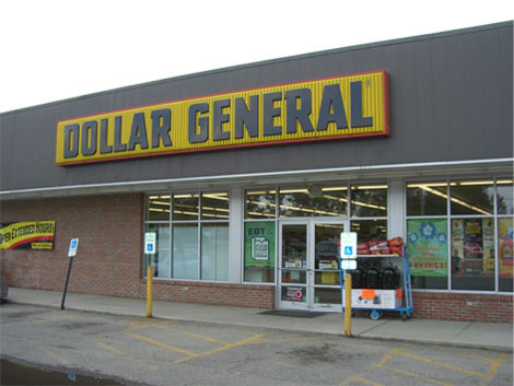

Old (above) and new (below) store exteriors.
Some of what you would expect is happening here. Updated typography to try and strip out some of the dated feeling but still retain some of the quirks. Focusing the color palette on the yellow and black, two-color scheme, rather than the previous three-color scheme. A payoff — “Save time. Save money. Every day!” — to speak to their audience about their intention to embody a convenient shopping experience with low prices. And the new visual gimmick that communicates stretching a dollar. All the pistons firing away to bring you this bright, shiny, new 1992 Mercury Sable. That’s really the first analogy that came to mind: it’s the low-cost model that was based off of another low-cost model. While it’s true that Dollar General is a generic store with convenience and low prices, there still remains no differentiator in the brand presence between them and other establishments. The red, black and yellow previous logo, with its condensed boxy letters had some equity and was easily identifiable. This new identity, while cleaned up and feeling a little less 1968 and a little more 1992, still appears like it came right off their shelves. Sphere: Related Content


No comments:
Post a Comment